Post Status Happiness Hour Session Thirty Nine
Oct 31, 2025 - 00:22:50
In this episode of Get It Seen: The Simplest Way to Accessible Design host Michelle Frechette and typography expert Piccia Neri discuss the vital role of typography in web accessibility. They explore how factors like fon...
Get It Seen: The Simplest Way to Accessible Design is an episode from WordPress | Post Status Draft Podcast by Cory Miller. In this episode of Get It Seen: The Simplest Way to Accessible Design host Michelle Frechette and typography expert...
This episode belongs to WordPress | Post Status Draft Podcast.
Use the player on this page to stream the episode online.
Published Aug 1, 2025, 00:43:04 long, audio available.
Continue listening to more episodes from WordPress | Post Status Draft Podcast.
Oct 31, 2025 - 00:22:50
Oct 1, 2025 - 00:32:20
Sep 26, 2025 - 00:48:51
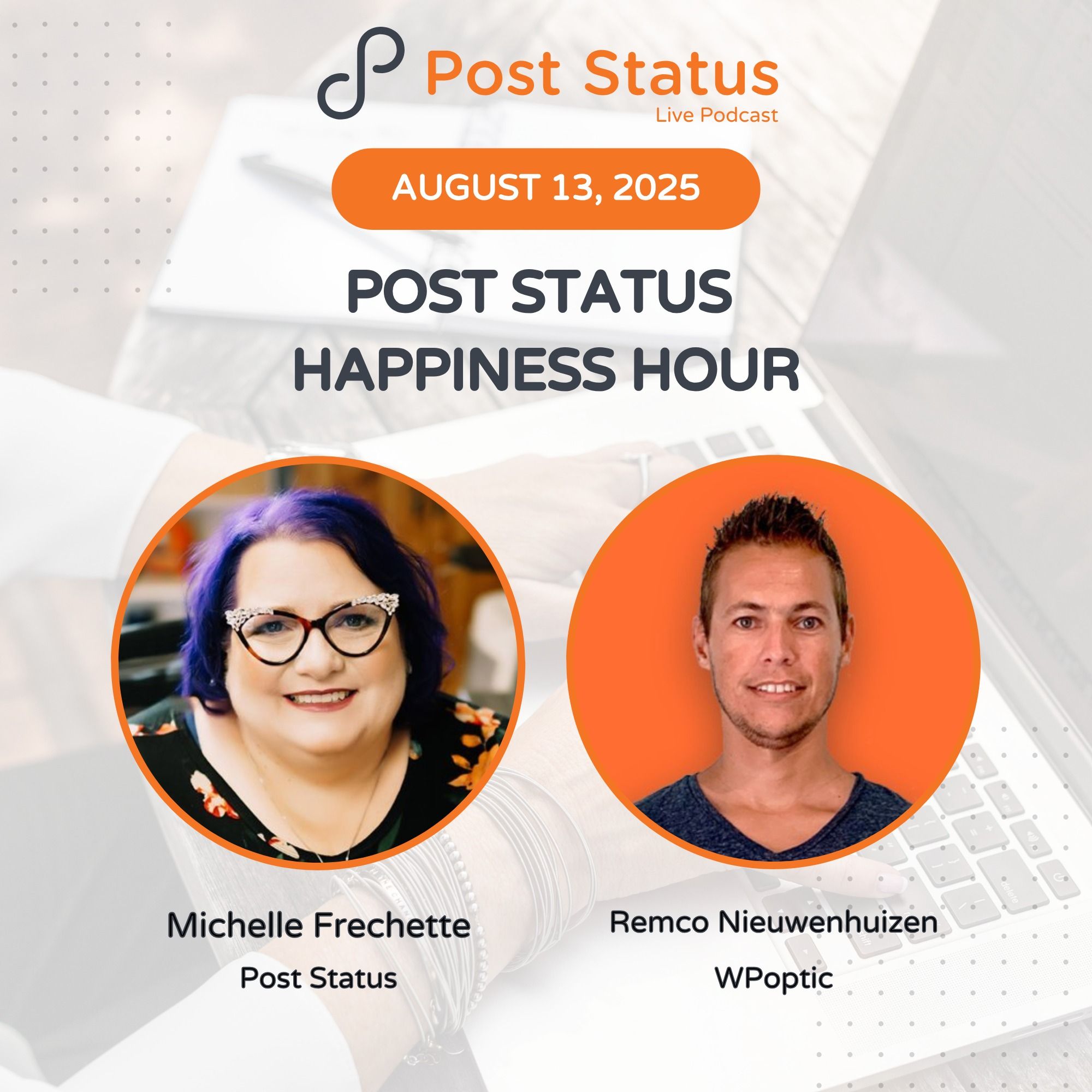
Aug 15, 2025 - 00:26:15
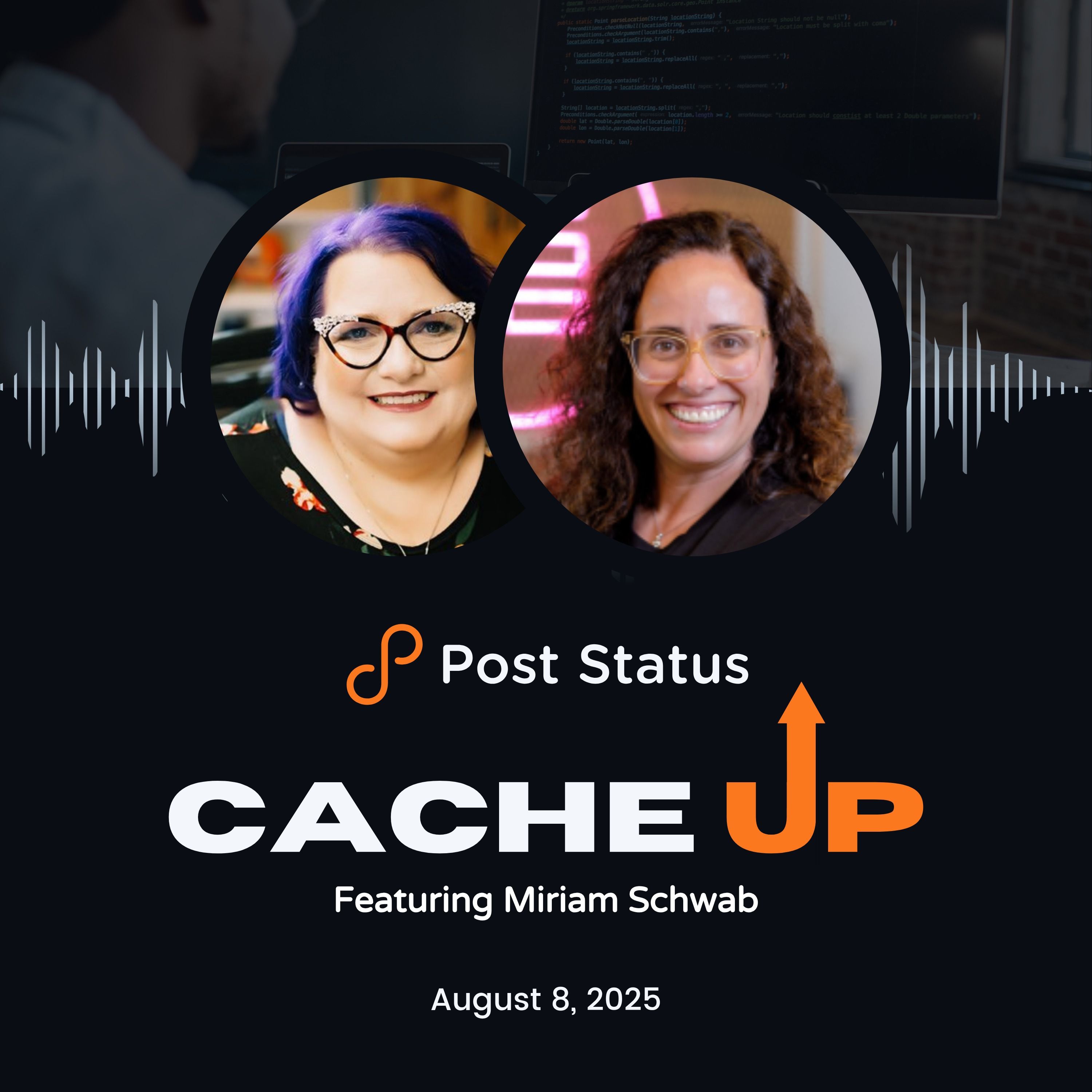
Aug 8, 2025 - 00:23:37
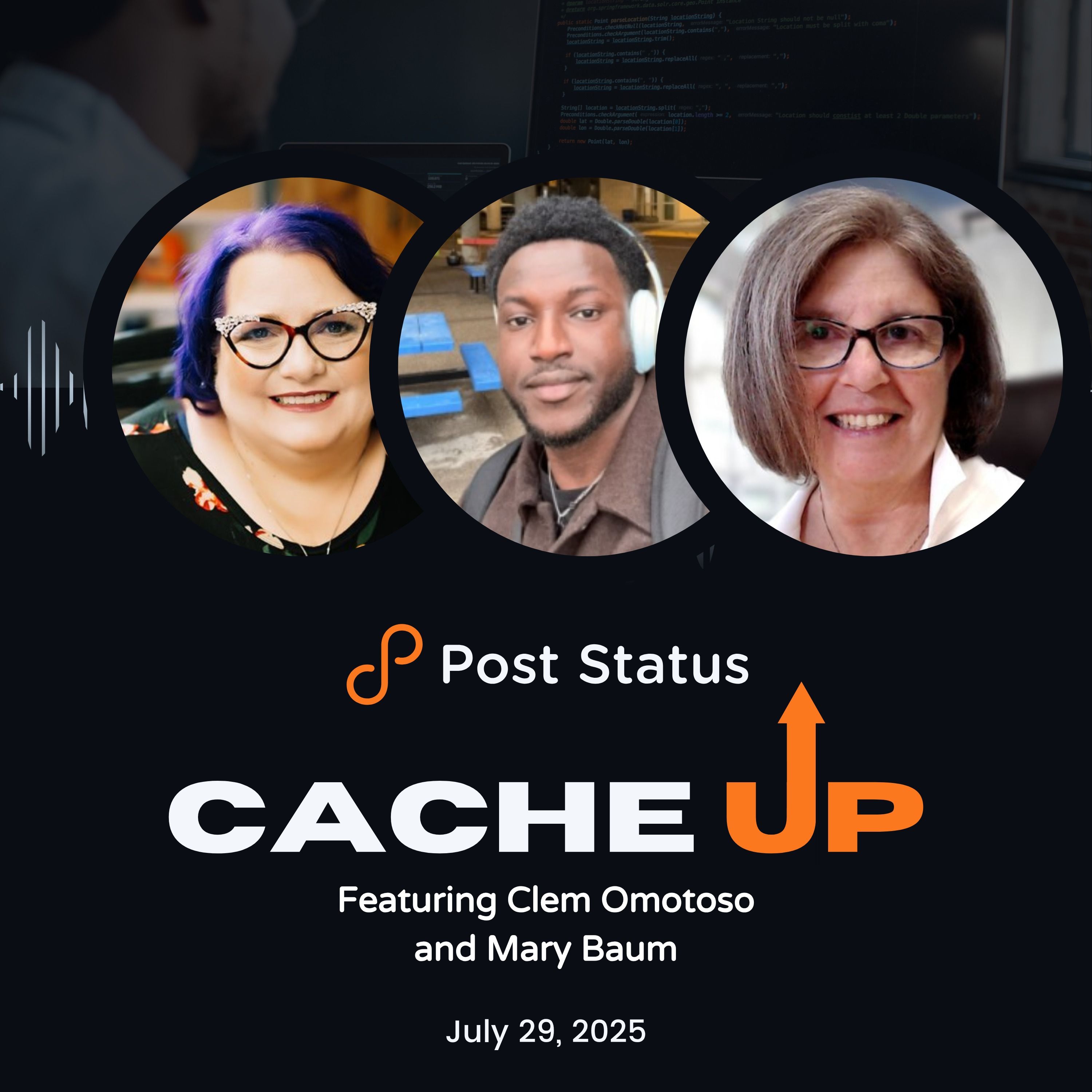
Jul 29, 2025 - 00:23:03
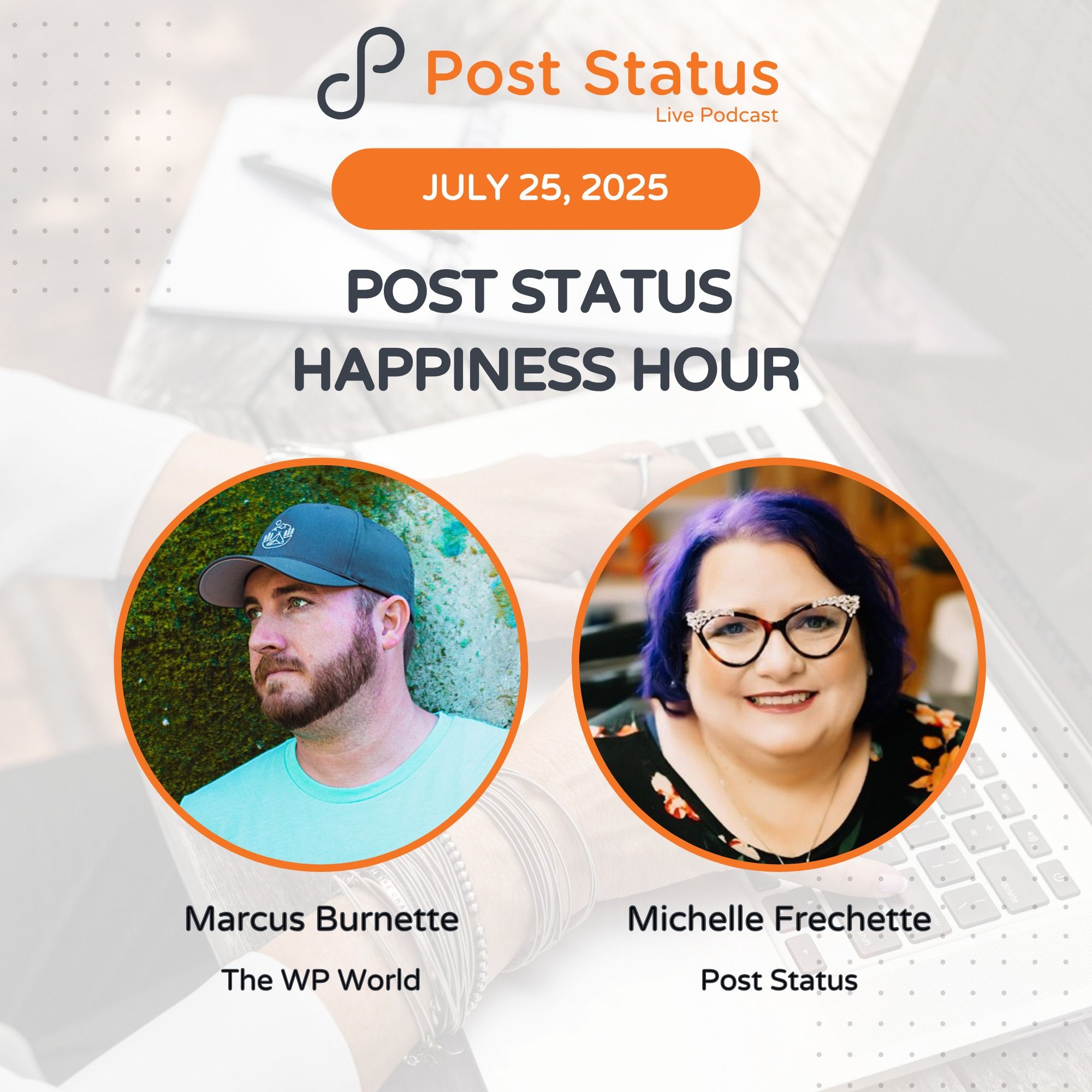
Jul 25, 2025 - 00:35:48
Jul 18, 2025 - 00:33:53